Sixty Seconds to See the Market

Welcome to our exploration of One-Minute Visual Digests of Market Shifts—snackable, chart-led updates that turn turbulence into clarity within a single minute. You’ll learn how we source trustworthy signals, design frictionless visuals, and craft punchy micro-stories. Expect practical tips, candid mistakes, and engaging experiments you can adapt today, plus invitations to comment, challenge assumptions, and request new digests tailored to the instruments you actually watch each day.

Designing Clarity Under Time Pressure

One minute forces ruthless choices: one question, one chart, one striking cue. We prioritize preattentive attributes—position, length, color, and motion—to surface change instantly, while annotations deliver precise context. During a volatile CPI release, a simple slopegraph beat a cluttered dashboard, driving better retention, faster comprehension, and more thoughtful investor questions.

Preattentive Cues That Do The Heavy Lifting

Contrast, proximity, and aligned baselines let eyes decide before minds debate. We reserve saturated color for the hero signal, use dull tones for context, and animate only when direction changes. Viewers read the punchline first, then scan supportive detail without cognitive thrash or uncertainty.

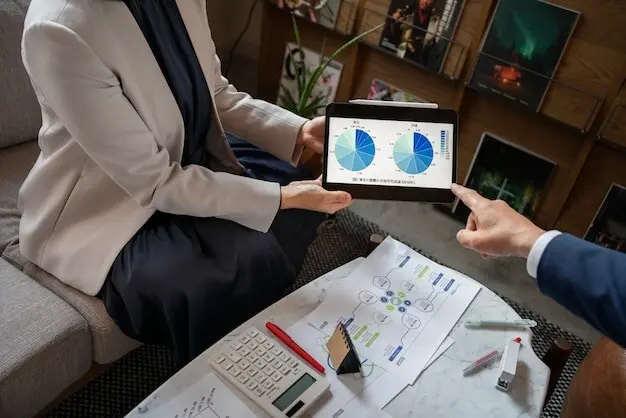
Chart Choices For Volatile Data

Lines reveal continuity, but sudden regime shifts shine in slopegraphs and step charts. For intraday turbulence, small-multiple candlesticks compress many windows into one calm glance. When scale warps perception, normalize to percentage or index values and stamp the transformation clearly to prevent misread momentum.

Sourcing Reliable, Real-Time Signals

Accuracy beats speed when stakes are real. We combine vetted APIs, scheduled scrapes, and official releases, then log provenance for every figure. Cross-source validation catches revisions early. During the jobs-report surprise, our backup feed prevented a false alert and seeded a crisp correction note within minutes.

APIs You Can Trust

Prioritize transparent documentation, stable endpoints, and clear rate limits. Mix institutional data like FRED and OECD with market feeds from reputable brokers, but sandbox everything first. Monitor schema drift, compare last values daily, and archive snapshots to diagnose discrepancies before they poison credibility or automated stories.

Cleaning Noise Without Killing Nuance

Outliers deserve investigation, not instant burial. Favor robust statistics—medians, trimmed means, and rolling windows—while exposing the smoothing method in plain language. Offer a toggle to view raw values. Readers trust balanced transparency, especially when revisions or holidays distort normal seasonal patterns and trader expectations.

Workflow: From Raw Numbers To A One-Minute Story

Triage And Sketch Within Five Minutes

When markets move, hesitation costs attention. We outline opening claim, evidence beat, and takeaway line on paper, not pixels. This constraint accelerates focus, reveals missing data, and keeps production anchored to the viewer’s question instead of seductive, time-wasting aesthetic detours or trendy effects.

Automate The Repeatables

Templates, data pipelines, and export presets turn chaos into cadence. Parameterized chart scripts and saved color palettes free attention for narrative judgment. Scheduled runs generate morning candidates; editors choose the clearest. Fewer clicks mean faster publishing and more energy for human nuance, ethics, and transparent sourcing.

The Last-Mile Human Pass

Automation accelerates, but accountability remains personal. A human editor checks causality leaps, unit clarity, and fairness toward affected sectors. We ask, would a new reader misinterpret risk here? If yes, we reframe, even if it delays the post by a precious few minutes.

Visual Formats That Stop The Scroll

Motion should clarify, not entertain itself. Gentle easing communicates acceleration without screaming; a single pulse spotlights the turning point. We cap duration to protect attention, avoiding strobe effects. Rehearse with screen readers and low-vision modes to ensure motion enhances understanding rather than creating confusion or fatigue.
A three-card sequence can compress an elegant argument: yesterday, today, implication. Keep each frame self-sufficient with short titles, consistent scales, and explicit units. The swipe introduces agency, inviting exploration, while preventing information overload by isolating steps that might collapse into clutter on a single canvas.
Legibility equals respect. We target comfortable contrast ratios, 14–16 point body text on mobile, and descriptive alt text that conveys purpose, not decoration. Captions help commuters, non-native speakers, and quiet offices, while transcripts enable search, translation, and archiving across time zones and evolving platforms.

Cognitive Science Behind The Minute

Working memory is scarce, roughly four meaningful chunks. We design for that limit by foregrounding a single insight, compressing context into bite-size comparisons, and removing decorative noise. Consistency reduces decoding load, leaving curiosity to power comprehension. Readers finish informed, not exhausted, and willing to return tomorrow.

Chunking Beats Clutter

Group related facts into compact clusters: price action, volume confirmation, plausible catalyst, measured implication. Present them in the same order every time. Familiar rhythms calm hurried brains, creating room for judgment. Surprise belongs in data, not formatting, which should behave like a trustworthy, predictable colleague.

Contrast Guides Attention

High contrast accelerates selection but can also scream. Reserve vivid saturation for the one line that matters, and shift everything else to patient grays. If two signals compete, stagger reveals. In internal tests, this alone lifted completion rates and comment quality without lengthening total watch time.

Narrative Anchors Improve Recall

People remember turning points better than raw magnitudes. We pair the key inflection with a named date, a short reason, and a takeaway framed as a decision. The story spine transforms numbers into meaning, helping busy readers tell the same insight forward to colleagues.

Measuring Impact And Iterating Smarter

We instrument for learning, not vanity. Completion rate, reply depth, and save-to-share ratios trump raw impressions. UTM-tagged links reveal which visuals nudge deeper reading. Weekly retros highlight misfires and wins, then feed next week’s slate. Tell us what you want prioritized; we will test promptly.
Sanolorotaririno
Privacy Overview

This website uses cookies so that we can provide you with the best user experience possible. Cookie information is stored in your browser and performs functions such as recognising you when you return to our website and helping our team to understand which sections of the website you find most interesting and useful.